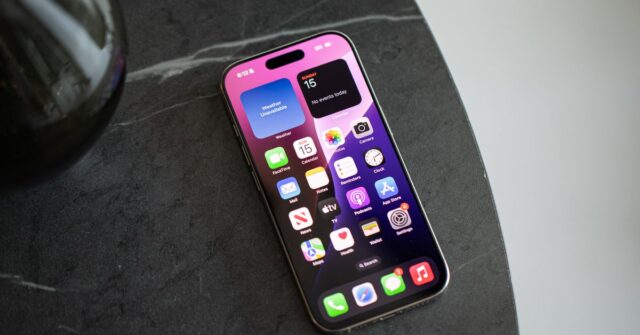
The grid is a comfortable place to live.
The app grid, I mean: the rows and rows of app icons on your iPhone’s homescreen. It’s familiar. Safe. It’s how I’ve lived with my various phones over the past decade. But at some point, it started to feel oppressive.
All those icons staring at me in the face, vying for my attention. The clutter! The distracting little notification badges! The grid was a reasonable way to organize apps when I had like, ten of them. There are sixty on the iPhone I’m using now, and I set it up from scratch a few months ago.
Naturally, living off-grid or in a non-traditional homescreen arrangement has been possible for much longer on Android. Google’s OS lets you keep your screen clear and just find your apps in the app drawer, which is always a swipe away. You can even replace the launcher entirely. But iOS — where every new app you download winds up on your homescreen by default — hasn’t exactly made it easy to abandon the grid.
That started to change when iOS 14 added widgets, an app library, and the ability to hide apps from your homescreen — though I haven’t developed the muscle memory to use it much. Now, iOS 18 adds even more flexibility. You can put apps and widgets anywhere you want on your homescreen, change their colors, and put more functions into the Control Center. But even as the apps and customization options have multiplied, most of us are still using our homescreens in basically the same way as we did with our first smartphones.
With the new options in iOS 18 — and getting a peek at other peoples’ well-curated homescreens — I decided it was time to do a little cleanup. Why should an app I only open once a month when I park downtown take up space on my homescreen year-round? Better yet, does any app deserve to occupy that precious real estate?
I spent about an hour deleting icons, arranging widgets, and adding controls to create my new homescreen. The camera control button on the iPhone 16 renders that icon unnecessary; the action button launches the oft-used daycare app, so that could go too. When I was done, my haphazardly maintained system of folders with cute emoji labels was whittled down to just four apps in the dock and a handful of widgets spread across two pages, which I’m affectionately calling “Windows Phone 2.0.”
Was it scary? A little. But you know what? I don’t miss those rows of icons at all. Nine out of ten times the app I’m looking for is in the Siri suggested apps that pop up when I open search. If not, I type in the first few letters of the app name and there it is. You could swipe over to the app library, I guess, but I hardly ever do.
The biggest drawback is that I’ll see a notification, dismiss it, and then forget about it for days since the app icon and its little red notification badge aren’t in my face anymore. But I missed things here and there even when I was living on the grid, and those badges are a real problem for me: I’m the kind of person who needs to reach badge zero, so I’ll constantly open apps just to clear out the notifications and get the red dot out of my face. Living off the app grid removes this distraction, and it’s the number one thing I appreciate about my new lifestyle.
I’m happy with my new homescreen, but some of my colleagues take the off-the-grid philosophy to the next level. Weekend news editor Wes Davis could teach a masterclass in functional iOS homescreens. He keeps a few apps in the dock, and Wordle gets a place on his grid, but outside of that it’s just widgets and shortcuts.
“I hate looking for things on my phone,” he told me. “All of this kind of started with me jumping on the bandwagon of ‘I want to use my phone less, and have it be less distracting.” The grayscale shortcut icons on his homescreen cut down on visual clutter, and he doesn’t feel as drawn to opening time-suck apps like TikTok when the icon isn’t right in front of him. Many of the shortcuts also contain drop-down menus, so he can launch right into the task he’s looking for.
Best of all, this method allows him to organize his phone by the action he’s trying to take. An icon labeled “Podcasts” launches whatever podcast app he’s using at the moment. If he ever starts using a different app, he’ll keep the same shortcut icon and have it launch a new app. “I don’t have to put a new app in there and get myself used to looking for that icon.”
“I try and keep it to just these seven apps.”
News editor Jay Peters takes a more straightforward approach. Like me, he finds the constant presence of app icons distracting. “If I don’t see the app right on my homescreen I’m way less likely to use it and just scroll with it.” He has a total of seven apps on his homescreen — including three in the dock — and will occasionally allow an app icon back onto the grid if he’s going to be using it a lot in a short period of time. “If I’m going on a big road trip or something, maybe I’ll move the maps app [at the top of the homescreen],” he says, “But otherwise I try and keep it to just these seven apps.”
Both of my colleagues have achieved a level of balance in their digital lives that I admire. I also heard from many more who said that they still maintain a homescreen filled with app icons, but they almost always skip the grid and go to Spotlight search when they need to open an app. And none of us knows quite when it happened, but more than one person I talked to agreed that the Siri suggested apps at the top of the search pane got really good at some point in the past. More often than not, the app I’m looking for is right there before I even type a letter into the search bar.
You don’t have to wait for AI or the metaverse or whatever to make your digital life less annoying
That kind of thing gives me hope for a future where personalized AI can help me find what I’m looking for on my phone, with less input from me. But if I’ve learned anything from this exercise, it’s that you don’t have to wait for AI or the metaverse or ambient computing or whatever to make your digital life less annoying. There are tools in our hands already; you just need a little courage to leave your comfort zone behind.


